
One month, 30 maps, 30 stories. Each day brings a new theme, a new idea, and a new way to visualize the world through data and creativity.
Every November, the global mapping community joins the #30DayMapChallenge — a creative journey that invites mapmakers to produce a new map every day based on a specific theme.
My goal is to explore open data, experiment with Python, Folium, and GeoPandas, and tell visual stories about how cities evolve, connect, and move.
This post will be updated daily as I progress through the challenge.
📅 Follow along — 30 days of maps, data, and design.
📍 Day 1 — Points: Restaurants in Pays de la Loire
For the first day, I mapped the gastronomic offerings of #paysdelaloire (France) 🍷🥖
Each point represents a restaurant, colored according to the 10 most common categories in the dataset.
A tasty glimpse into the geography of taste 😋✨
Data source: https://data.nantesmetropole.fr/
Tourist offerings: restaurants in Pays de la Loire.
🧩 Tools : Python, GeoPandas, Matplotlib
🎨 Theme : Points

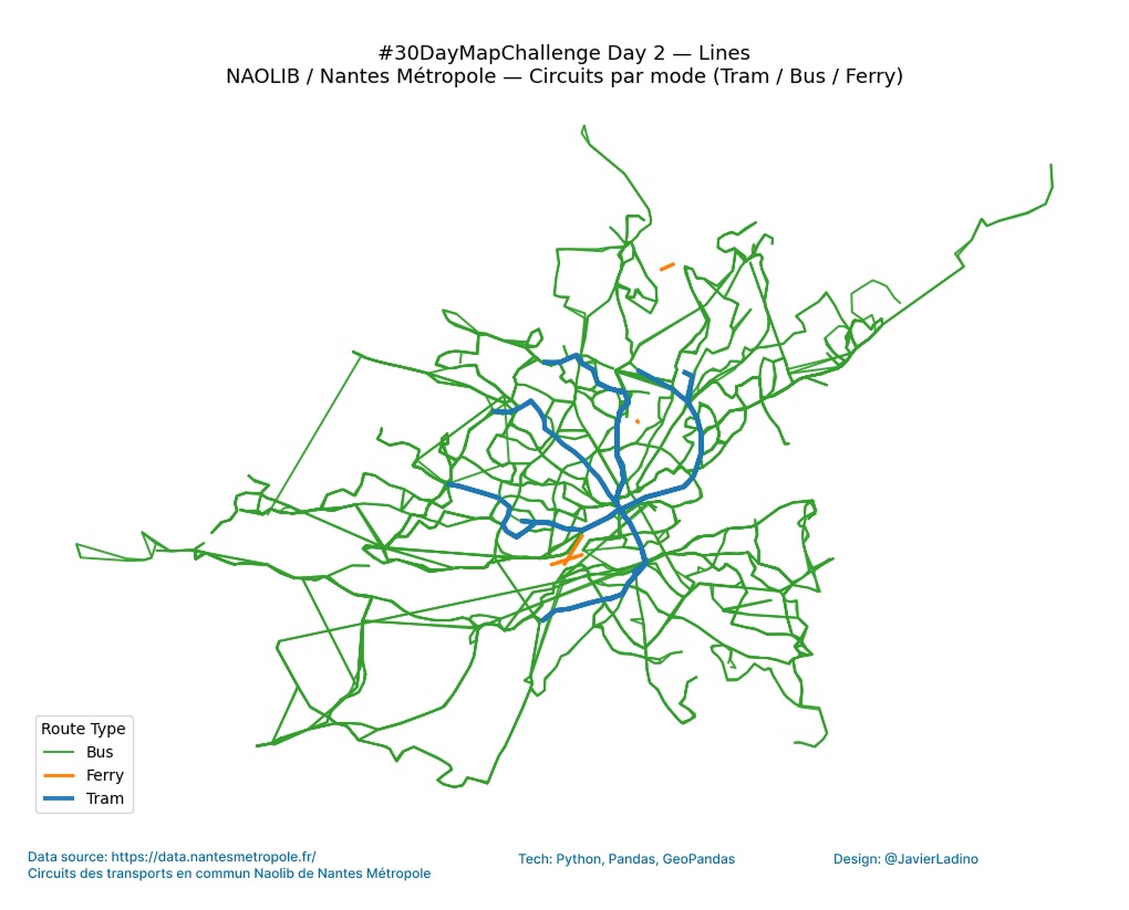
🚋 Day 2 — Lines: Naolib Transport Circuits
Bus, tram, and ferry routes in Nantes Métropole. Each mode of transport is represented by a distinct color and line. We explore the routes of the NAOLIB transport network in #Nantes Métropole (France) 🇫🇷
🧩 Tools: Python, GeoPandas, Matplotlib
🎨 Theme: Lines
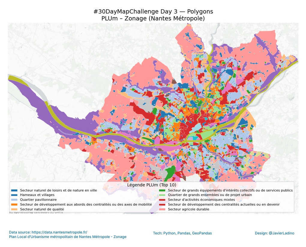
🏙️ Day 3 — Polygons: Urban Zoning (PLUm)
We explore the Local Urban Development Plan (PLUm) of #nantes Métropole 🇫🇷 🗺️
Each polygon represents a different urban area, reflecting how the city is organized and developed through its land use 🌆
The colors indicate the different categories of the PLUm, providing a visual overview of the balance between housing, industry, nature, and public services.
🧩 Tools: GeoPandas, Contextily
🎨 Theme: Polygons
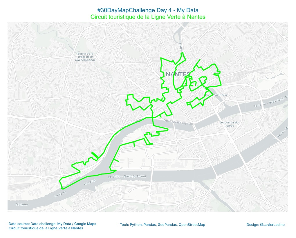
💚 Day 4 — My Data: The Green Line (Le Voyage à Nantes)
We follow the route of Nantes’ Green Line 🇫🇷, a trail that invites you to discover art, architecture, and culture while walking through the city.
A personal map recreated from the official route of Le Voyage à Nantes, using Python, Folium, and OpenStreetMap 🗺️
Each curve is a fragment of the journey, an urban story that intersects with the footsteps of thousands of visitors each year. 🚶♀️🌿
🧩 Tools: Python, Folium
🎨 Theme: My Data
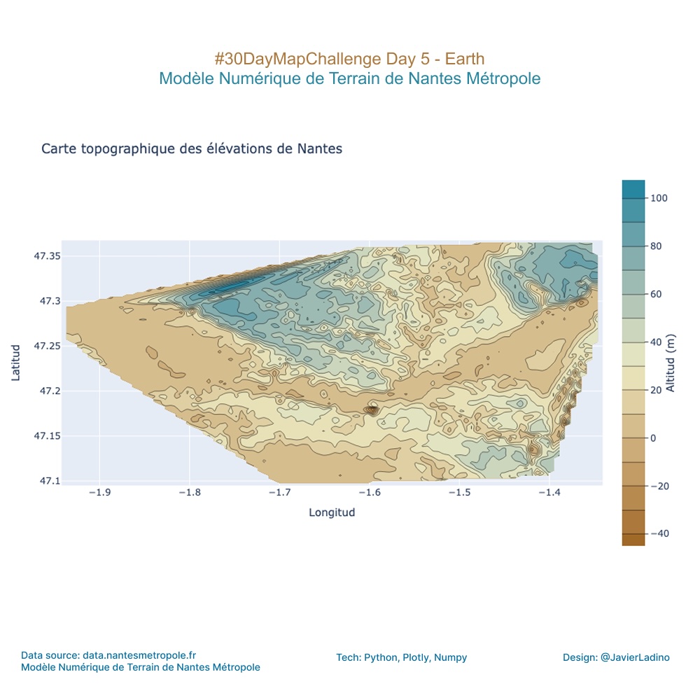
🌍 Day 5 — Earth: Terrain and Elevation
For the #30DayMapChallenge, I focused on the solid ground beneath our feet: the elevation of Nantes!
This topographic elevation map was generated from Digital Terrain Model data. Each contour line reveals the subtle geological patterns that shape the city, from the banks of the Loire to the highest points.
I used Python (Pandas + Plotly) to interpolate the thousands of elevation points and create this relief grid. A little data science to uncover the landforms!
🧩 Tools: Python, Pandas, Plotly
🎨 Theme: Earth
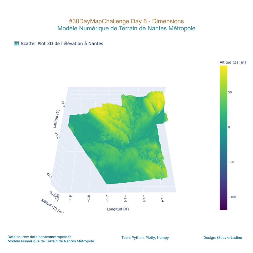
🔷 Jour 6 — Dimensions : Scatter plot 3D de l’élévation à Nantes.
We took data from the Nantes Métropole Digital Terrain Model and transformed it into an interactive 3D elevation model. The result is a simulation of the topography of Nantes, using altitude as our key third dimension.
It’s amazing how a simple layer of data can reveal a whole new urban landscape. Can you see where the highest points are?
🧩 Tools : Python, Plotly, Numpy
🎨 Theme : Dimensions
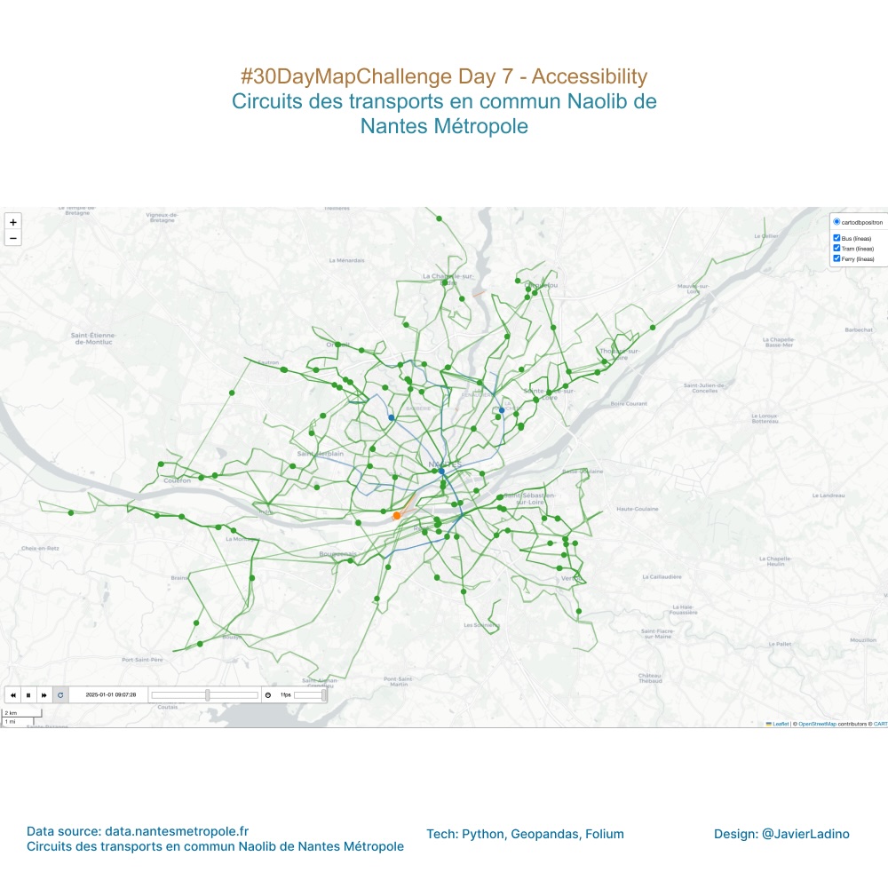
🚍 Day 7 — Accessibility: Mobility and Transport Flow
Today we visualize how Nantes moves.
Buses, trams, and ferries from the Naolib system travel throughout the French city in an urban choreography where mobility becomes accessibility. 🌍
The map shows the actual circulation of each line, highlighting how public transport connects neighborhoods, people, and opportunities.
A constant flow that represents city life and the importance of designing more accessible spaces for everyone. ♿💚
🧩 Tools: Python, Folium + TimeDimension
🎨 Theme: Accessibility
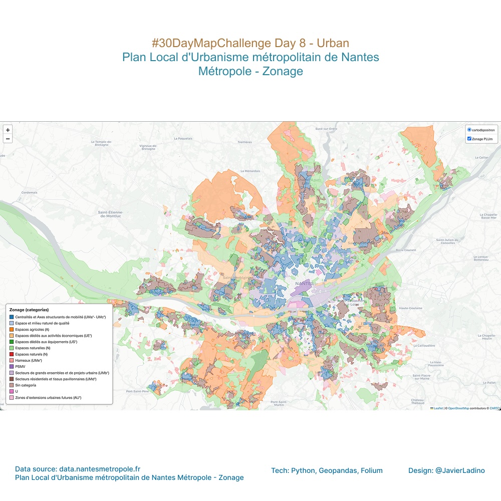
🏙️ Day 8 — Urban: World Urbanism Day
Using Python, GeoPandas, and Folium to bring the Plan Local d’Urbanisme Métropolitain (PLUm) of Nantes to life.
Each color represents a zoning category — a visual snapshot of how the city is planned and organized 💡
🧩 Tools: Python, GeoPandas, Folium
🎨 Theme: Urban
✏️ Day 9 — Analog: Handmade Mapping
Today it was time to leave the screen behind and get my hands dirty with paint! 💧
This is my handmade map of Nantes, inspired by the watercolor style of The Legend of Zelda. 🏰🌿
There’s nothing like a brushstroke to bring a map to life 💛
🧩 Tools: Pen, Paper, Watercolor (Analog)
🎨 Theme: Analog

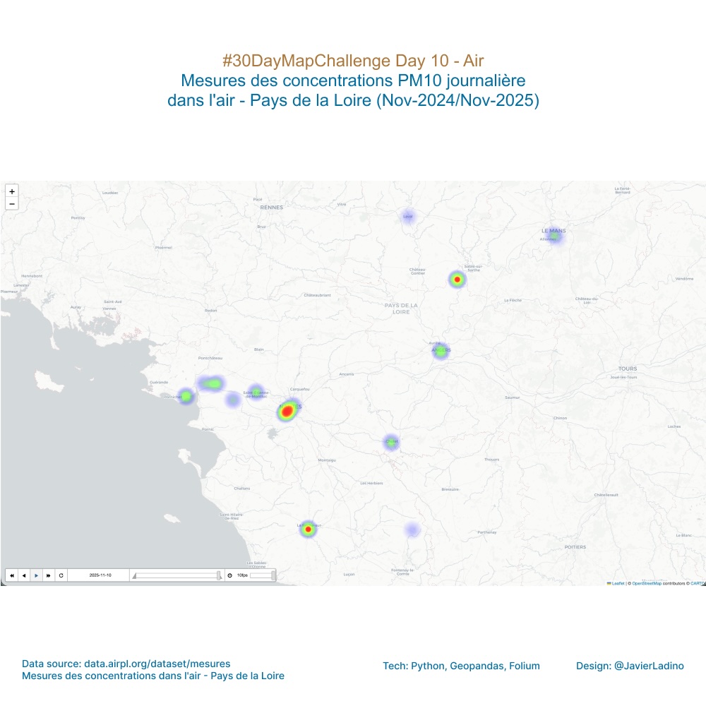
🌬️ Day 10 — Air: Mapping the Atmosphere
Today I visualize the invisible: daily concentrations of PM10 particles in the air in Pays de la Loire 🌫️
Each dot and color represents how pollution levels have changed over the last year.
A map that breathes, made with data, code, and curiosity 💨
📍Data: Air concentration measurements
🧩 Tools: Python, Folium, Pandas
🎨 Theme: Air
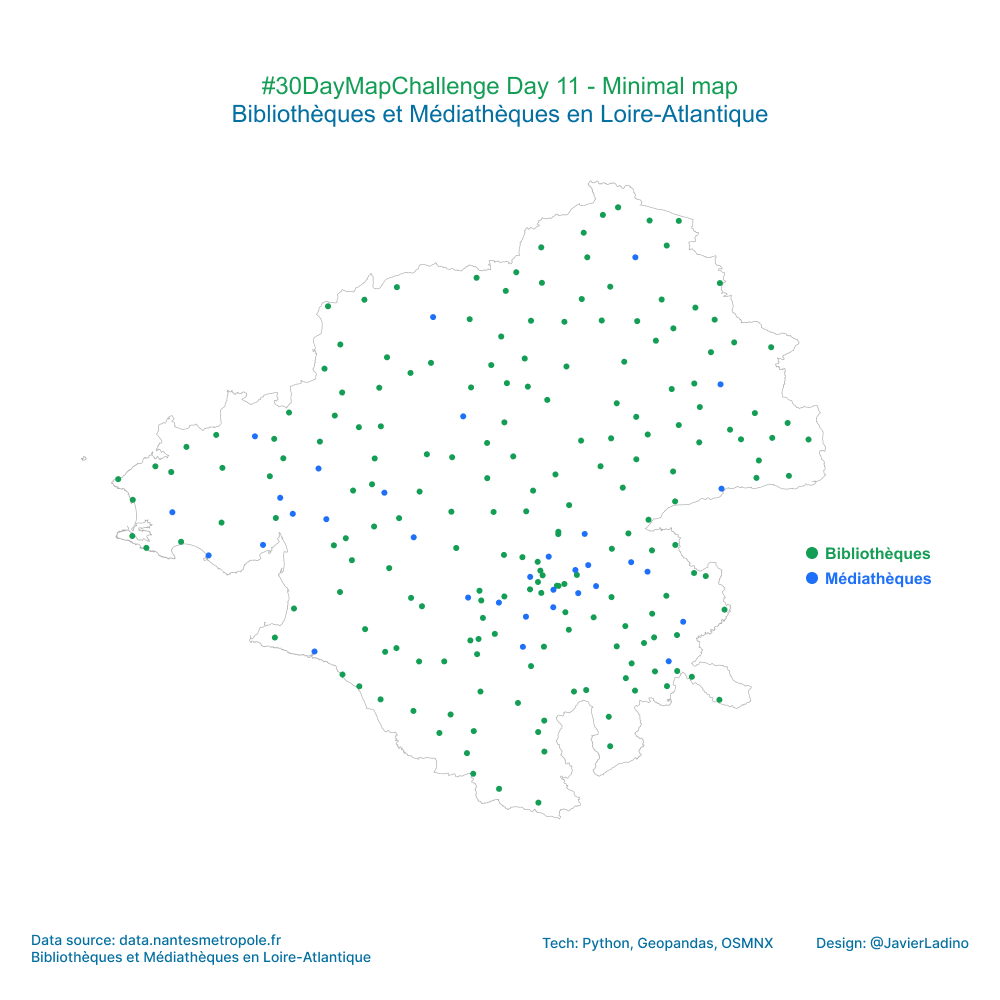
⚪ Day 11 — Minimal Map
Today’s challenge was to represent a territory using as few elements as possible, while still conveying useful information.
This map shows the libraries and media libraries in the Loire-Atlantique department (France), with a purely visual approach:
🟩 Libraries
🟦 Media libraries
Using OSMnx, GeoPandas, and Folium, only the outline of the department and the cultural points within it were drawn.
No labels, no extra colors, no noise: just form and meaning.
👉 Sometimes, the simplest design is the one that communicates best.
🧩 Tools: OSMnx, GeoPandas, and Folium
🎨 Theme: Minimalist map
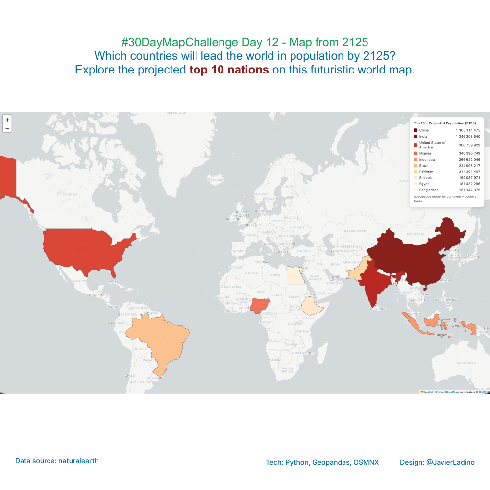
🔮 Day 12 — Map from 2125
Let’s imagine what the world will look like in 100 years.
This speculative map projects the global population toward the year 2125, exploring which countries could have the largest populations based on current trends and continental growth scenarios.
🧭 Based on estimated population data and growth rates differentiated by region, the exercise seeks to visualize the future through cartography, not as an exact prediction, but as a way of reflecting on how demographic change will transform our human geographies.
💡 The ten most populous countries in 2125 show a shift in the demographic axis toward regions with strong population and urban dynamics.
📊 Created with Python, GeoPandas, and Folium, combining data analysis, projections, and interactive visualization.
🧩 Tools: Python, GeoPandas, and Folium
🎨 Theme: Map from 2125
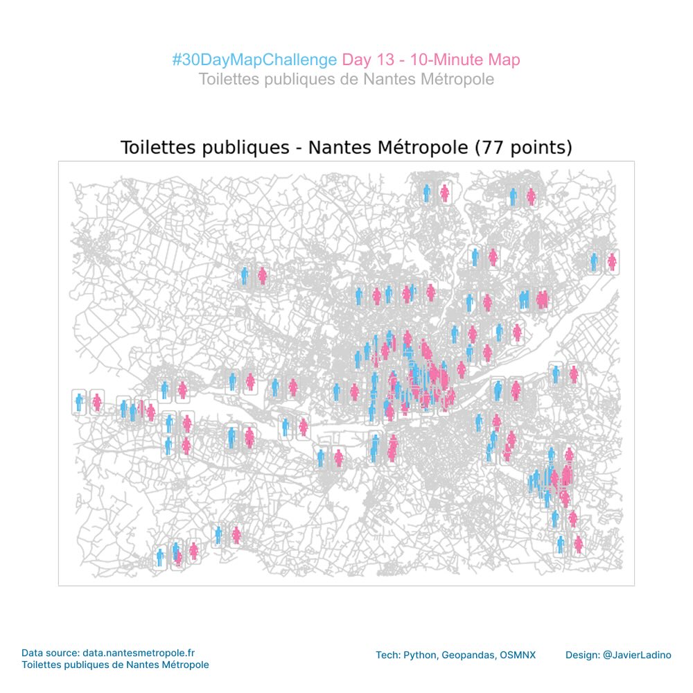
⏱️ Day 13 — 10 Minute Map
Today we focused on speed: a map created in less than 10 minutes using open data from Nantes, Python, and a small custom SVG icon.
A perfect exercise to remind us that sometimes the key is not perfection… but clear and simple communication.
🔍 Dataset: Toilettes publiques – Nantes Métropole
The best part? Seeing how a set of points comes to life when you give it context and your own design.
🧩 Tools: OSMnx + GeoPandas + Google Colab
🎨 Theme: 10 Minute Map
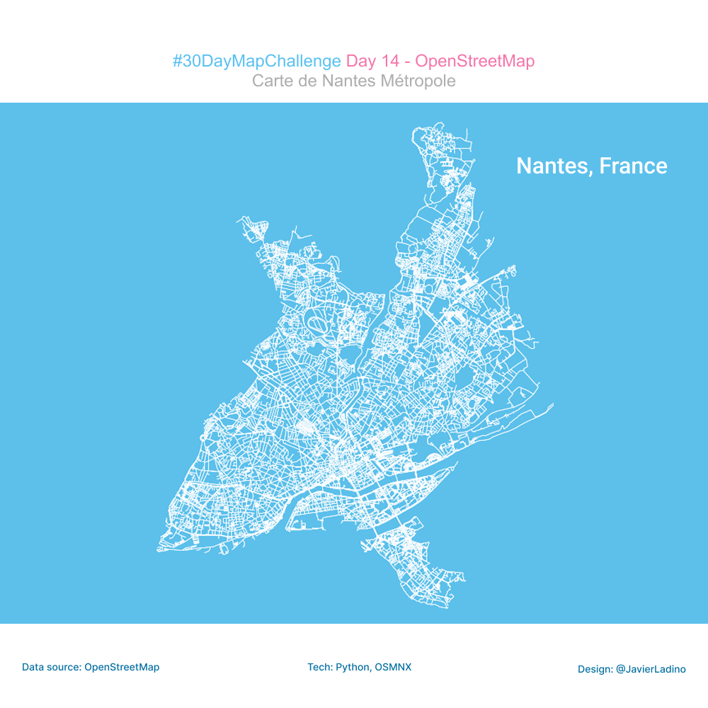
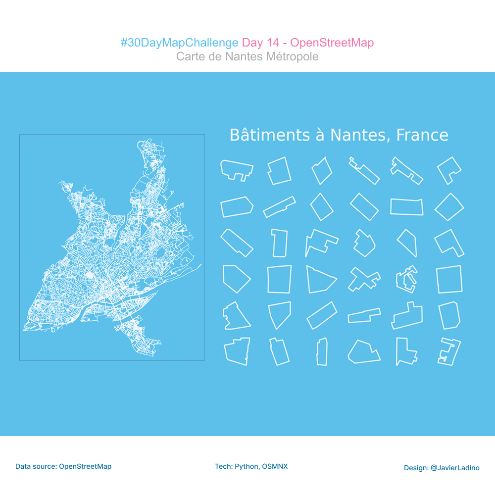
🗺️ Day 14 — Data Challenge: OpenStreetMap
For today’s challenge, dedicated to OpenStreetMap (OSM), I worked with one of my favorite places to explore urban data: Nantes.
Using the prettymaps library, I extracted the footprints of buildings directly from OSM and projected them onto the RGF93 / Lambert-93 system (EPSG:2154) to build a visualization based on a geometric mosaic.
This type of exercise not only allows us to appreciate urban morphology from a different angle, but also to experiment with new ways of representing spatial data in a creative and accessible way.
🧩 Tools: OSMnx, Python, PrettyMaps
🎨 Theme: OpenStreetMap
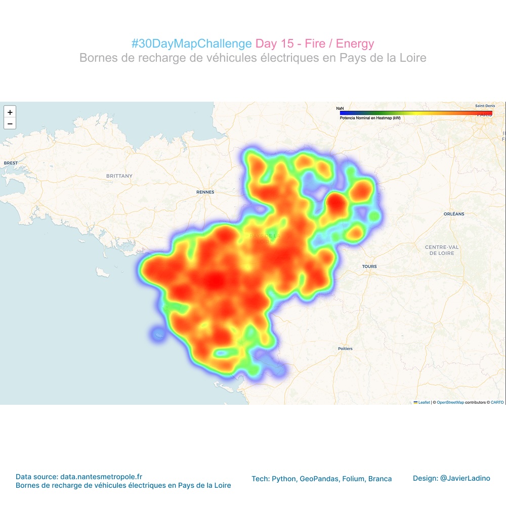
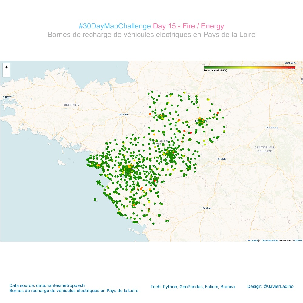
🔥 Day 15 — Fire: Mapping Energy
Today I explored energy in the region: electric vehicle charging stations in Pays de la Loire.
Using a GeoJSON dataset, I built a heat map where each point contributes intensity according to its nominal power (kW), using a continuous Viridis scale to reveal the most powerful energy sources in the region.
The result: a visualization that shows how the charging infrastructure is distributed and where the highest capacity points are concentrated. 🔥🔌
🗺️ Tools: Python, GeoPandas, Folium, Branca
🔋 Topic: Energy / Heat / Fire
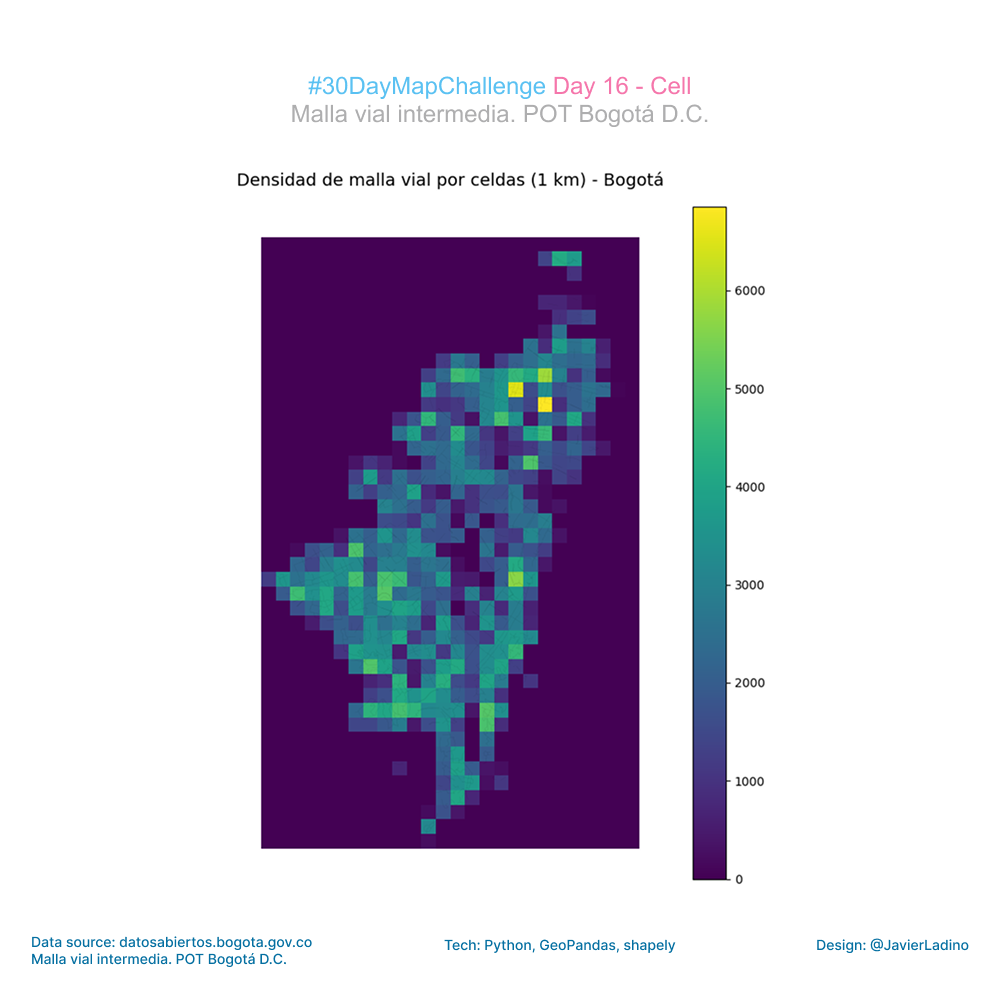
🧬 Day 16 — Cell
For this challenge, I worked with Bogotá’s road network, exploring how the street network reveals urban patterns when viewed from a spatial cell-based perspective.
I took the official dataset from the open data portal and integrated it into an ETL flow in Python:
- cleaning and projection in a metric CRS,
- generation of a 1 km² cell grid,
- calculation of the total length of roads per cell,
- and final visualization with a continuous Viridis scale.
🔍 What does the map show?
A very clear pattern of urban density:
- central and northeastern areas with a higher concentration of roads,
- peripheral areas with little road infrastructure,
- and a spatial transition that describes the morphology of Bogotá quite well.
This “cell mapping” approach simplifies complex urban datasets and highlights territorial contrasts that normally go unnoticed when working with lines alone.
Dataset: Bogotá Road Network (Open Data)
🧩 Tools: Python · GeoPandas · Shapely · Folium/Matplotlib · Geospatial ETL
🎨 Theme: Cell
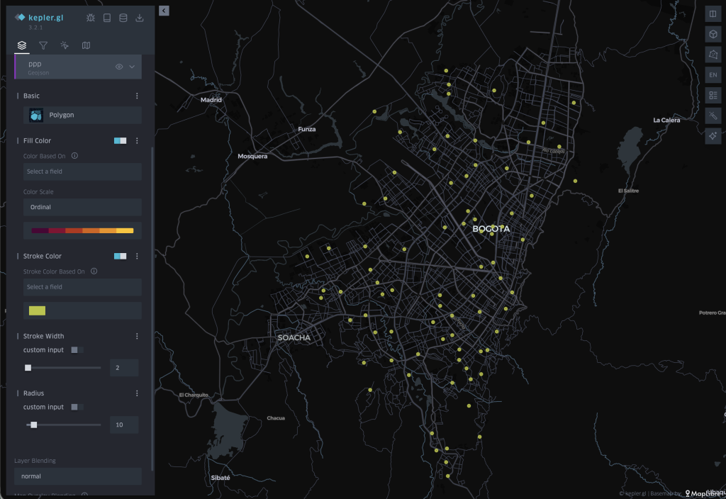
🧠 Day 17 — A New Tool
For today’s challenge, I wanted to explore a tool I had never used in depth before: kepler.gl, an interactive platform for geospatial analysis developed by Uber.
The goal was to visualize and better understand a very valuable social project in Bogotá: the Paraderos para Libros para Parques (PLP) or Book Stops for Parks.
These reading stations located in public parks seek to promote reading, bring books closer to citizens, and create spaces for community gatherings.
Working with this dataset was an opportunity to combine territorial analysis with cultural initiatives that transform the city.
🔎 What did I do today?
- I explored the kepler.gl interface and capabilities for the first time.
- I imported and mapped the PLP points from open data.
- I tested different visualization styles, color scales, interactions, and layers.
- I generated a clear view of the distribution of these reading points in Bogotá.
Data: GeoJSON from Bogotá Open Data.
🧩 Tools: Kepler.gl.
🎨 Theme: A New Tool.
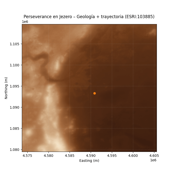
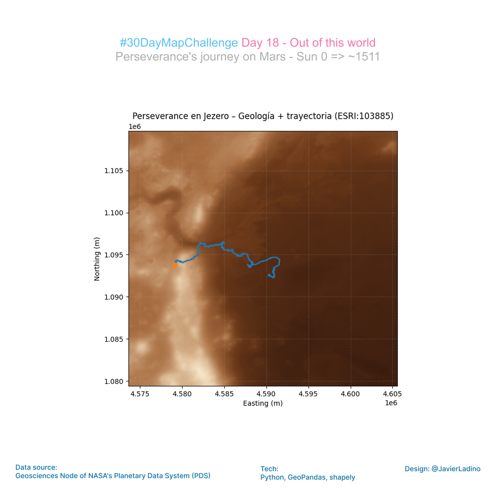
🪐 Day 18 — Out of This World
For today’s challenge, I decided to leave Earth and map the most recent movements of the Perseverance rover in Jezero Crater on Mars.
Using NASA’s public location data, I projected the rover’s route onto a HiRISE/CTX mosaic of the crater and built a Python animation showing its journey from sunrise to sunset across the Martian landscape.
This exercise has been particularly enriching: it combines planetary science, cartography, data engineering, and visual storytelling in a single workflow.
🔧 Tools and data
- Mars 2020 PLACES dataset (NASA)
- HiRISE/CTX mosaic (Jezero Crater)
- Custom color map inspired by Mars
- Coordinate transformation to the Martian system (ESRI:103885)
Each day of this challenge invites you to explore new ways of visualizing space, data, and the stories we can tell with them.
🔴 Exploring Mars, sunrise to sunset.
🧩 Tools: Python, Rasterio, matplotlib, numpy
🎨 Theme: Out of This World
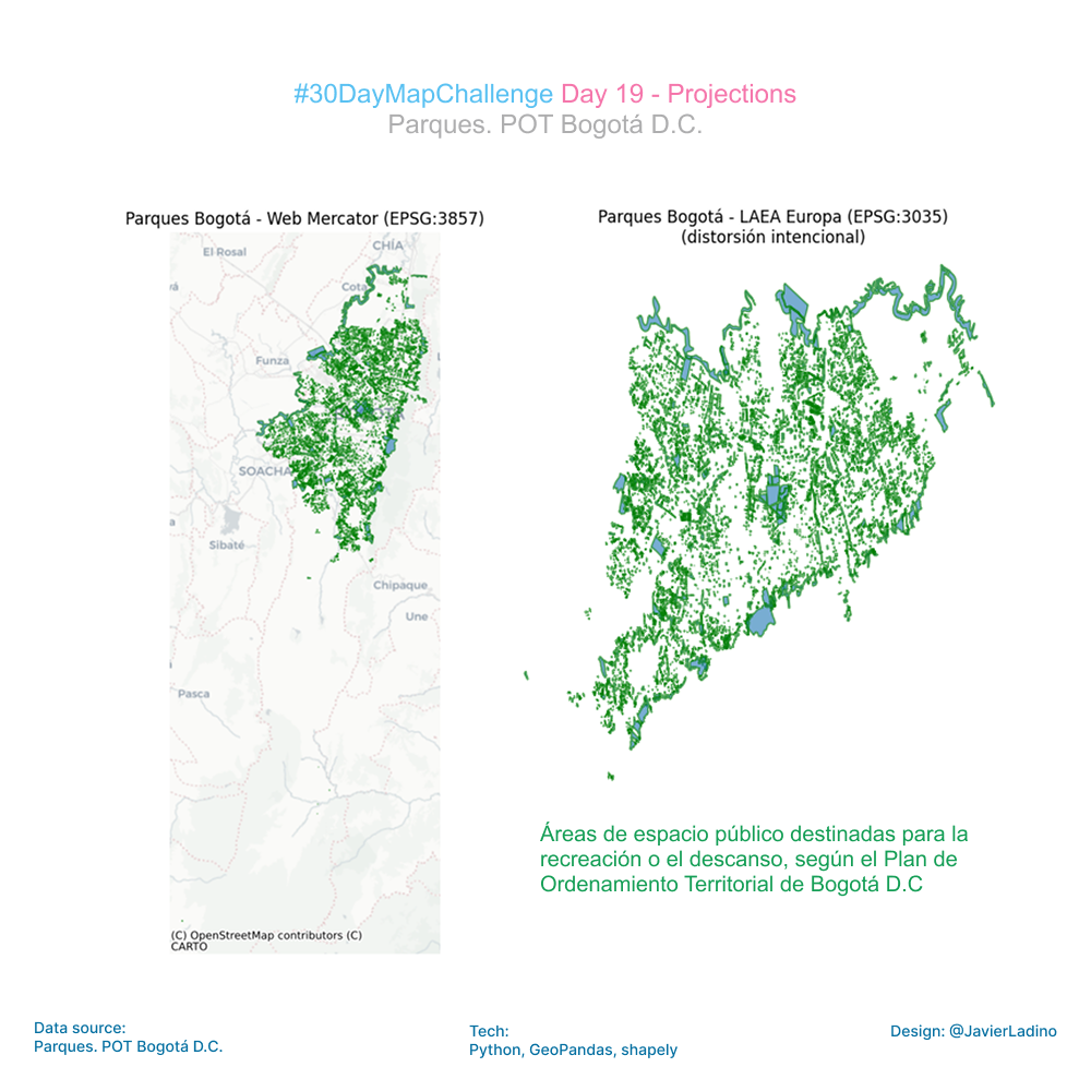
🌐 Day 19 — Projections (GIS Day)
For Day 19 of the #30DayMapChallenge — Projections (GIS Day) — I explored how drastically a map can change depending on the projection behind it.
Using Bogotá’s official open data (Parques POT), I visualized the city’s parks in two very different projections:
🔹 Web Mercator (EPSG:3857) – the familiar web‐mapping standard
🔹 Lambert Azimuthal Equal Area centered on Europe (EPSG:3035) – a projection completely unsuited for Bogotá
The result? A striking distortion that highlights a fundamental truth in cartography:
Every map lies… but understanding how it lies is what empowers good spatial analysis.
This experiment is a reminder that projections are not just technical details — they shape perception, scale, and interpretation. Choosing the wrong one can completely warp the story your map tells.
Grateful for open data initiatives like Datos Abiertos Bogotá that make these explorations possible.
Happy #GISDay! 🌍
#Geospatial #Cartography #OpenData #Bogotá #SpatialThinking
🧩 Outils : Python, contextily, matplotlib
🎨 Thème : Projections
💧 Day 20 — Water
For today’s challenge, I worked with the water network that crosses and surrounds Bogotá, using the official dataset and a minimalist base map generated with OSMnx.
The goal was to visualize how rivers, streams, and canals structure the territory.
Working with urban water data always reveals another way of reading the city: from its flows, its slopes, and its natural routes.
🧩 Tools: Python, GeoPandas, Matplotlib
🎨 Theme: Water

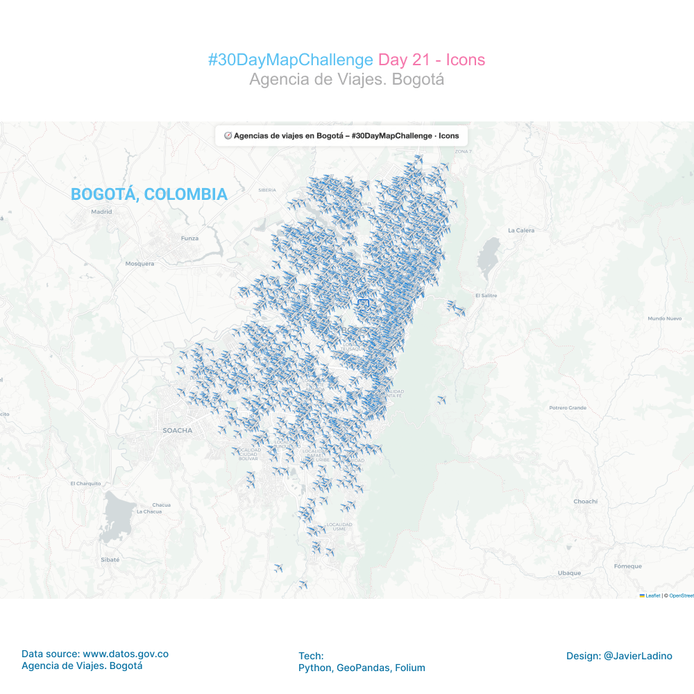
🧭 Day 21 — Icons
For this challenge, I wanted to give cartography a more playful and visual touch: instead of traditional markers, I used custom icons to map the location of travel agencies in Bogotá. ✈️🌍
Using the avia.geojson file, I added a small PNG icon to each point to create a more expressive and fun map that reflects the distribution of tourist attractions in the city.
🔍 What does the map show?
The concentration of agencies in key commercial areas.
The dispersion of service points in different neighborhoods.
An urban pattern that speaks to mobility, services, and local tourism.
🛠️ Tools used
• Python
• GeoPandas
• Folium
• Custom icons (PNG)
• Bogotá open data
Small visual details can completely transform the way we interpret a map. This exercise demonstrates how icons and symbols can tell urban stories in a more intimate and engaging way.
🌍 Day 22 — Data Challenge: Natural Earth
For this challenge, I worked with the Natural Earth dataset to build a world map of population density, combining geospatial accuracy and cartographic design.
The process included:
🔹 Downloading and cleaning data from Natural Earth
🔹 Calculating actual areas using Mollweide projection (ideal for area analysis)
🔹 Calculating density (inhab/km²) per country using the POP_EST field
🔹 Classifying into discrete ranges (0–10, 10–50, 50–100, … >1000 inhab/km²)
🔹 Final visualization in Robinson projection, with a clear legend associating color ↔ density range
The result is a small-scale map, but revealing in its content:
⬛ low-density countries in soft tones,
🟩 densely populated regions in intense tones,
⚪ areas without clearly differentiated data.
🛠️ Tools
• Python (GeoPandas, Matplotlib)
• Natural Earth datasets
• Mollweide + Robinson projections
This type of exercise shows how, with public data and open tools, it is possible to generate global visualizations that tell profound stories about demographics, territory, and spatial inequality.

🧩 Day 23 — Process
For the “Process” challenge, I decided to document the entire workflow behind the map and animation I created for Day 18 – Out of This World, where I visualized the movements of the Perseverance rover on a HiRISE/CTX mosaic of the Jezero crater on Mars.

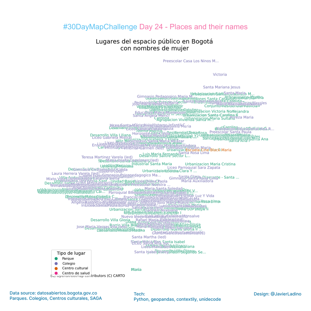
🗺️ Day 24 — Places and Their Names
For Day 24 of the #30DayMapChallenge — Places & Their Names, I decided to look at Bogotá from a very particular angle: public spaces named after women.
Using open data from the city, I combined four data sets:
✔ parks
✔ school
✔ cultural centers
✔ health centers
I then filtered all the places named after women — historical figures, artists, educators, community leaders, or symbolic female references.
The result is a map that shows how women’s presence is written into the city: where they are remembered, celebrated, or represented. It’s a way of remembering that place names are not just geography: they are memory, identity, and visibility.
This exercise shows how spatial analysis can uncover social patterns and how open data allows us to rethink our cities from new perspectives.
Grateful to all the women whose names are part of Bogotá’s urban landscape. 💜
Data: https://datosabiertos.bogota.gov.co/
🧩 Tools: Python, geopandas, contextily, unidecode
🎨 Theme: Places and Their Names
🔷 Day 25 — Hexagons (Classic Challenge)
For this challenge, I worked with the official dataset of annual average PM2.5 in Bogotá (2024) and built a visualization based on a grid of regular hexagons, a perfect technique for identifying spatial patterns without relying on administrative boundaries.
The goal: to show how fine particulate matter (PM2.5) pollution is distributed in different areas of the city, using a more homogeneous and visually clean approach.
🔍 What did I do?
- I imported the official PM2.5 dataset from Bogotá Open Data.
- I converted the coordinates to a metric CRS to construct a regular hexagon grid.
- I generated a well-proportioned hexgrid (flat-top hexagons).
- I calculated the average PM2.5 per hexagon using spatial intersections.
- I visualized the result with GeoPandas + Matplotlib on a minimalist base map.
The final result reveals areas with higher concentrations and areas where the air is significantly cleaner, offering an intuitive reading of air quality in Bogotá.
🧩 Data: Bogotá open data (PM2.5)
Visualizations like this facilitate clearer urban diagnostics and help us think about public health and sustainable mobility solutions.
💨 A map to understand how we breathe the city.
🧩 Tools: Python, GeoPandas, Shapely, Matplotlib, Contextily
🎨 Theme: Hexagons

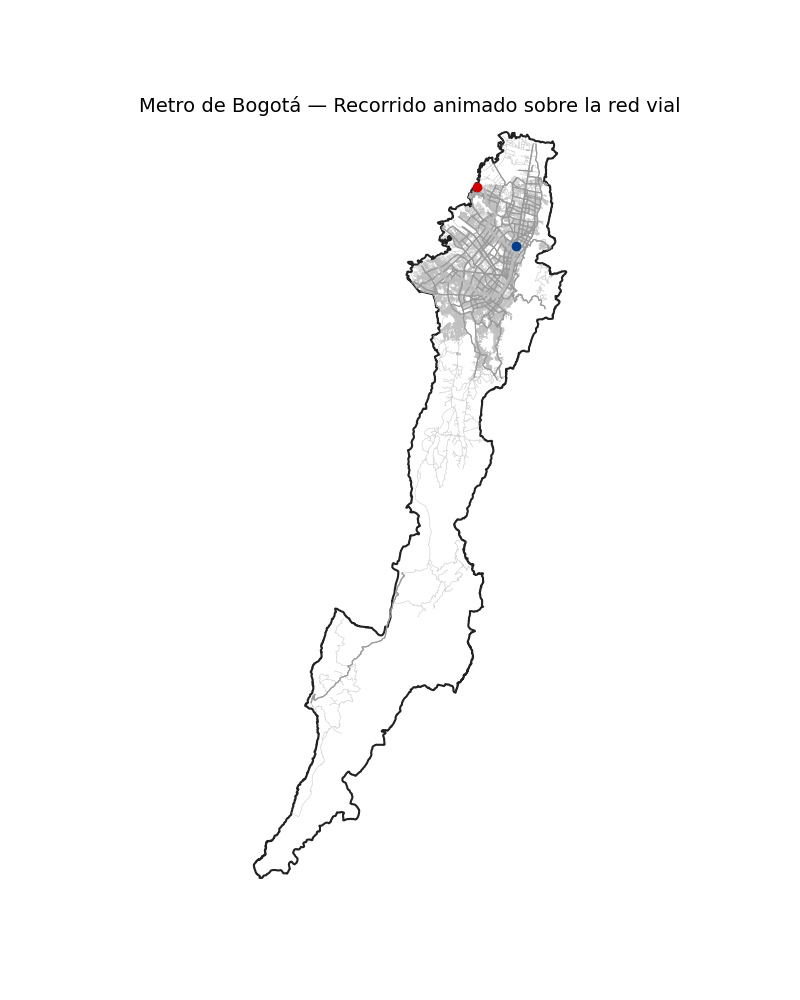
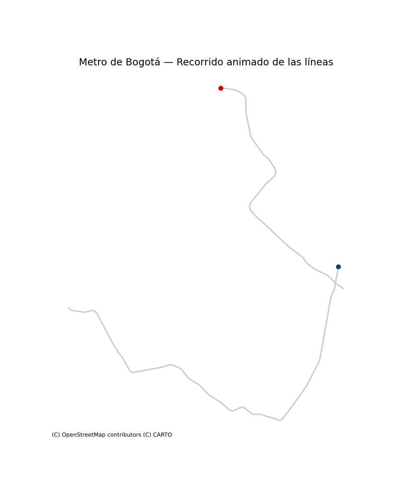
🚆 Day 26 — Transport (World Sustainable Transport Day)
For today’s challenge, I decided to focus on one of Colombia’s most important infrastructure projects: the two lines of the future Bogotá Metro.
Using the official KMZ files, I reconstructed the routes and integrated them into a fully vector-based basemap generated with OSMnx, allowing the city’s road network to be visualized in great detail.
🔧 What does this map include?
- Extraction and processing of the metro routes (KMZ → KML → LineString)
- Download of Bogotá’s road network using OSMnx (updated dataset from OpenStreetMap)
- Visualization of the urban context with road hierarchy
- Two highlighted metro alignments with distinct visual identities
- ⭐ An animation where each line advances with a dashed-line effect and a moving “train” following its path
🎯 Why this approach?
Because sustainable mobility becomes easier to understand when visualized within the real urban fabric. Seeing the lines in their geospatial context helps communicate their scale, impact, and relationship with the city.
🧩 Technologies used
• Python
• GeoPandas
• OSMnx
• Shapely
• Matplotlib (animation)
• Fiona (KMZ/KML reading)
📍 Today’s theme: Transport
Mobility, infrastructure, and city—brought together in a single map!
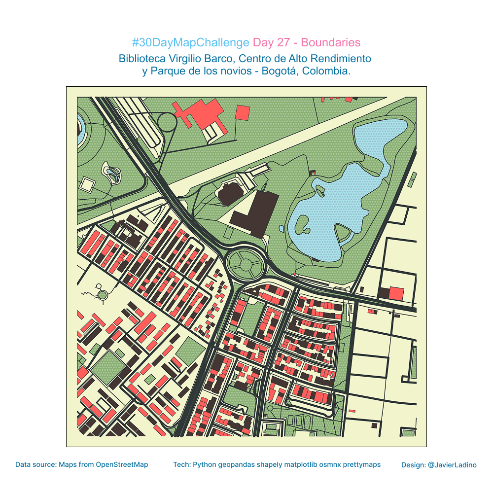
🧱 Day 27 — Boundaries
For today’s theme, I explored how different types of boundaries —physical, functional, and perceptual— shape urban experience.
My focus: three emblematic places in Bogotá, each with its own spatial identity and surrounding limits:
📚 Biblioteca Virgilio Barco
🏋️ Centro de Alto Rendimiento
🌳 Parque de los Novios
Using a combination of Python (GeoPandas, Shapely, OSMnx, Matplotlib) and the creative layout capabilities of Prettymaps, I mapped the outlines, transitions, and buffer zones that define these spaces.
🔍 What this map highlights
- How public facilities generate distinct spatial envelopes
- The interplay between roads, green areas, and built form
- Boundaries not just as dividing lines, but as zones of interaction
- The ways urban design influences movement, access, and perception
Boundaries are more than edges—they are interfaces where the city negotiates uses, flows, and identities.
🧩 Tech stack
• Python
• GeoPandas
• Shapely
• OSMnx
• Matplotlib
• Prettymaps
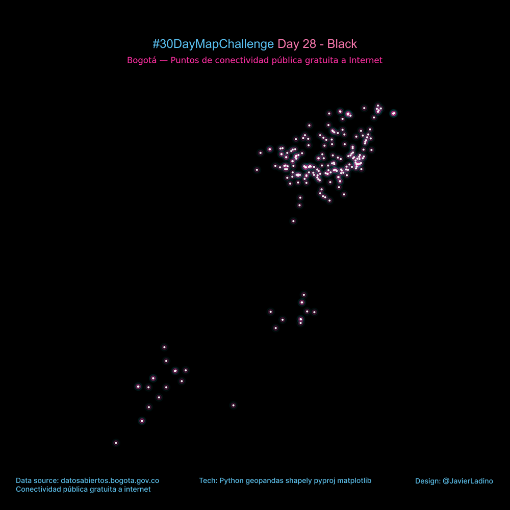
⚫ Day 28 — Black (Black Friday)
For today’s challenge, I wanted to explore the aesthetics of darkness and contrast.
I took the locations of free public Internet hotspots in Bogotá and represented them on a completely black canvas, inspired by a cyberpunk style: neon lights, luminous halos, and a sense of a hyperconnected city.
The result is a map where WiFi access points look like digital constellations, revealing urban patterns of access and technology use.
🔧 What does this map include?
- Reading of the official dataset in GeoJSON format
- Conversion to metric coordinates (EPSG:3857)
- Multi-layer visualization to simulate glow (cyan + magenta + white)
- Dark “night-tech city” aesthetic
🧩 Technologies used
• Python
• GeoPandas
• Shapely
• Matplotlib
📍 Theme of the day: Black
Exploring the city from a position of absolute contrast, where light comes only from information.
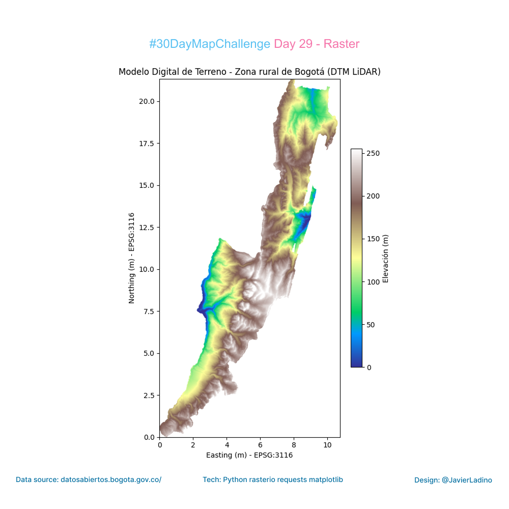
🧮 Day 29 — Raster (Classic Challenge)
For today’s challenge, I worked with one of the most powerful tools for understanding the territory: the Digital Terrain Model (DTM) of rural Bogotá, generated from LiDAR data and available on the city’s open data portal.
From the XML file of the WMS service, I accessed the official raster directly, retrieved the elevation band, and built a map in Python that shows the topography in detail: valleys, hillsides, slopes, and landforms that define the rural landscape of Bogotá.
🔧 What does this work include?
Automatic reading of the WMS from the XML file.
Download of the elevation model in GeoTIFF format.
Raster processing with Rasterio.
Representation in a terrain-type palette (or any other desired palette).
Export to high-resolution image.
🌄 Why raster?
Because digital terrain models allow us to understand much more than just heights: they reveal geomorphological patterns, hydrological dynamics, land use, and even constraints on infrastructure and mobility.
🧩 Technologies used
• Python
• Rasterio
• Matplotlib
• Requests
• Bogotá Open Data (LiDAR – DTM)
📍 Topic of the day: Raster
🎨 Day 30 — Makeover
To close out the #30daymapchallenge (Day 30: Makeover), I decided to redesign a classic point map and give it an interactive twist.
The Open Data Nantes dataset tells us that there are 77 public restrooms in the city. But seeing 77 points on a static map doesn’t tell us much about actual “accessibility” when you need it.
📍 The Redesign: I created a dynamic visualization system using Python and Leaflet. Instead of just showing locations, the map responds to the user’s mouse:
It detects the nearest node in real time and displays its name.
It calculates instant visual isochrones: it connects only those restrooms that are less than a 5-minute walk away (approx. 450 meters) with lines.
The result is a “network of nearby neighbors” that communicates density and distance at a glance, without the need for clicks.
What do you think about adding dynamic interactivity to traditional static maps? 👇
🧩 Tools: Python and Leaflet.
🎨 Theme: Makeover


